Shading, drying, flow, feathering...
Stay tuned
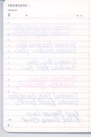
Shading
One of the joys of using a fountain pen is that beautiful, moist trail of the second most wonderful of liquids - ink. However, as you write, the amount of ink laid is not exactly uniform, resulting in more dye being applied at the ends of strokes, than in the middle. For those scientists among you, this is due to viscosity and surface tension.
Shading greatly depends on the pen and how wet the nib is. Dryer and broad nibs typically give better shading. Flex nibs often give shading not only at the ends of strokes, but also on the borders of the line.
So, more dye - more colour. The picture below is a good example.

While in some inks we only notice the ink becomming paler, other inks (especially dark ones) may reveal unexpected colours. For example, Noodlers Air-Corp Blue-Black is green, when applied lightly (see picture below) - so when writing it shades from dark green to black.

Saturation is a measure of how much die is actually in the ink. Some inks (like Baystate Blue on the picture) are highly saturated. Such inks really stand out on the page, however in most cases their shading is poor as well - what may be considered as a drawback by some.


Density
Density is sometimes used for shading - this is not correct however, since density is simply weight divided by volume, and as such has no noticeable impact on ink.
Feathering
Feathering describes how crisp are the edges of strokes. Basically in case of inks that feather significantly (like one on the picture), the fibres of paper spread the ink, and there is no definite line boundary. In non-feathering inks, the line is crisp and definite.

Feathering hugely depends on paper.
Bleedthrough/Showthrough
This describes how visible is the writing on the other side of the page. Example of bad bleedthrough:
Drying time
Describes how long it takes for the ink to dry out once it was laid on the paper. Paper affects this to a degree, but ink and nib have the most impact.
Wetness
It describes, how much ink is laid on the paper. It is dependend on pen and ink combination, with some impact from the paper. Typically wet inks look more saturated, since it increases effective amount of die on the page.
If you have any questions/suggestions/opinions, please comment.
Adam
Some of the pictures were taken from harmless-dilettante.blogspot.com.
Links to the sources of the rest:
http://www.vintagepen.net/
http://abeautifulliving.blogspot.com/
http://www.dr-ben.at/wordpress/
No comments:
Post a Comment