I've just received Herbin 1670 Anniversary Limited Edition ink. It is already included in the price list, and below is a little photostory about the ink (including samples at the end). The ink has one secret drawback - described at the end of that post
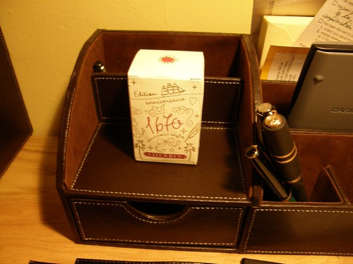
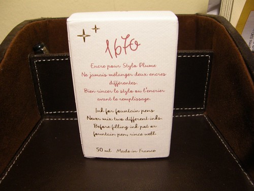
So this is the wonderful box the ink comes in. The paper is very nice, high quality with some texture to it (look closely). All the print is in either red, or in gold (I mean REAL gold colour, rather than yellow).
On the back there is a warning, stating that the ink should not be mixed. I wonder, why they are mentioning it so explicitly (I have never heard of such notice on ink box, even Noodlers Baystate inks have no warning on the label itself).
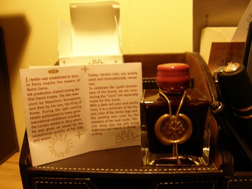
The first peek into the box:
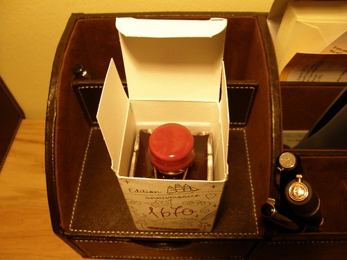
The bottle is quite beautiful. The seal and cap are made of real wax, rather than cheap plastic. Mind, that the cap is extremely fragile, take care when opening if you want to preserve the looks - below the wax is a normal (rather ugly) metal cap.
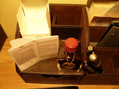
Enclosed leaflet describing the history of the company, and the ink as well as what does the colour represent. Leaflet is in french, german, english and italian.
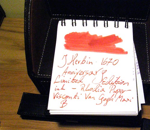
And here is the sample of the ink itself. Lovely colour! Quite saturated - swab shows little colour variance, and to get that I had to apply ink 5 times! Still, with wet pen the colour variation is quite nice.
Now, the drawback I mentioned... The neck of the bottle is awfully small - I don't think anything thicker than Reform 1745 or a Parker vector would fit.
Adam
No comments:
Post a Comment